How do you turn a trusted name into a recognized brand?
The Moment
Teeples Plumbing & Drilling had long been a trusted name in the community, but their brand identity hadn’t kept pace with their growth. Over the years, the business had operated under a few different names (including Applegate Plumbing and Applegate Teeples Plumbing) which led to some inconsistency in public perception. Combined with a disjointed digital presence and no dedicated marketing efforts, they needed a cohesive, modern brand that reflected the quality of their work and the strength of their reputation.
The Work
We started by aligning their identity with their evolution, renaming and rebranding as Teeples Plumbing & Drilling, Inc. to reflect their expanded services and professional reputation. From there, we built a full visual and verbal identity system that included a logo update with alternate versions, a refined color palette with custom icons and patterns, and brand messaging that clearly articulated their mission, values, and voice. We also developed a streamlined, user-friendly website with emergency UX features to better serve their customers.
To boost visibility and human connection, we produced branded photography and video content, including a commercial featuring the owner discussing local commercial plumbing services in Modesto and Turlock. This not only added authenticity but helped put a face to the name.
Our work extended into advertising, with successful Meta and Google Ads campaigns that increased calls and strengthened brand awareness. We also delivered printed marketing materials and branded promotional items, created team apparel to unify their presence, and organized a full brand photo shoot to showcase their new vehicle wraps and team identity.
The Impact
Teeples Plumbing & Drilling now shows up in the market as the brand they’ve always been in practice: reliable, neighborly, and rooted in community. The new website and advertising efforts are already driving more customer calls and creating stronger local brand recognition. Internally, the rebrand sparked team pride, giving employees a stronger sense of ownership and identity.
This wasn’t just about looking the part, it was about helping a great business finally be seen as the leader it already was.
Case Study
What does it mean to feel truly ROOTED?
The Moment
ROOTED Salon was at a pivotal juncture—a fresh identity ready to debut, but with a challenge: how to make it more than just a new look. The rebrand needed to be a catalyst for energy, a signal of growth, and a unifying force for both employees and clients. More than aesthetics, it was about shaping an experience—one that would be felt the moment someone stepped inside. As a branding agency in Modesto, our role was to craft a branding strategy that was as intentional and rooted as the salon itself, ensuring every visual element, from logo design to business collateral, aligned seamlessly.
The Work
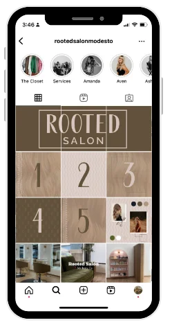
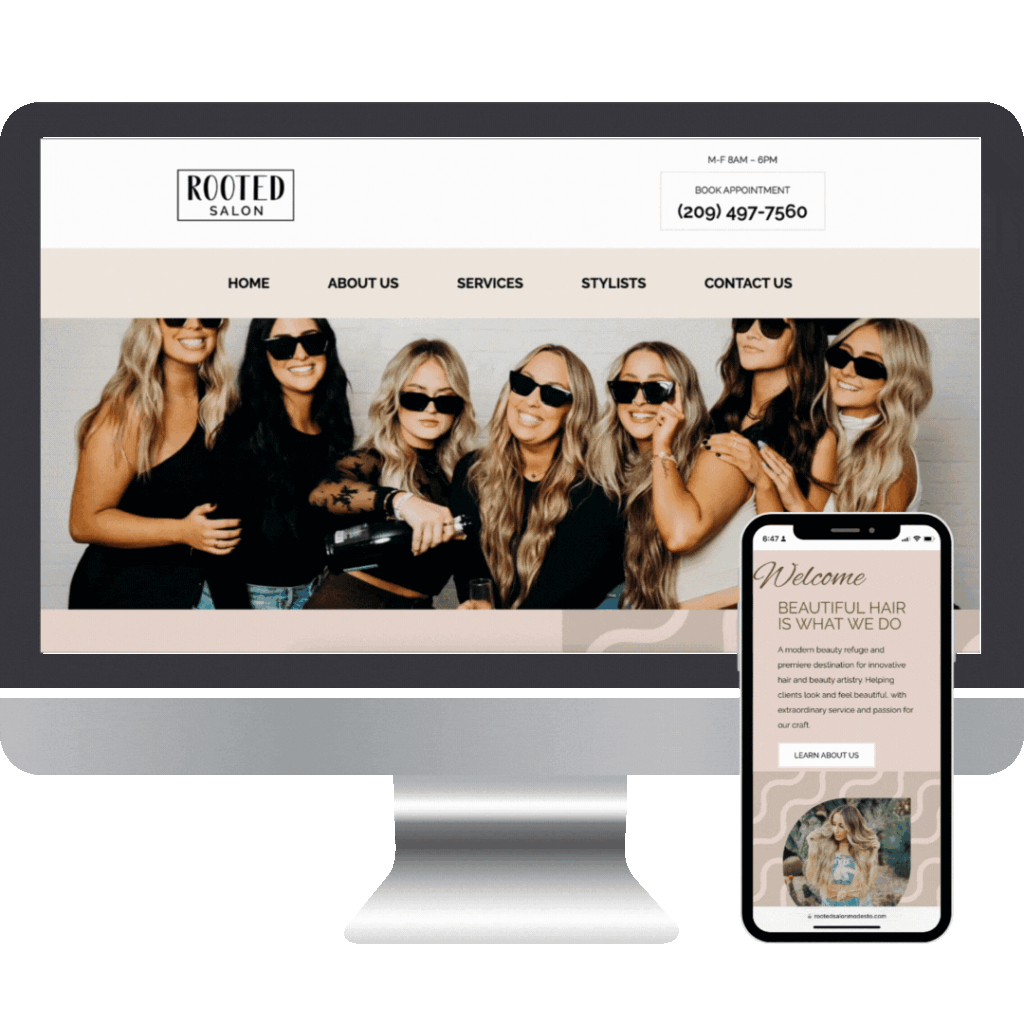
We started with a bold, modern identity that served as the foundation for the brand’s presence, then developed a strategic rollout plan to introduce key brand elements in a way that sparked curiosity and excitement. The website redesign transformed their online presence into an intuitive, immersive extension of the ROOTED experience.
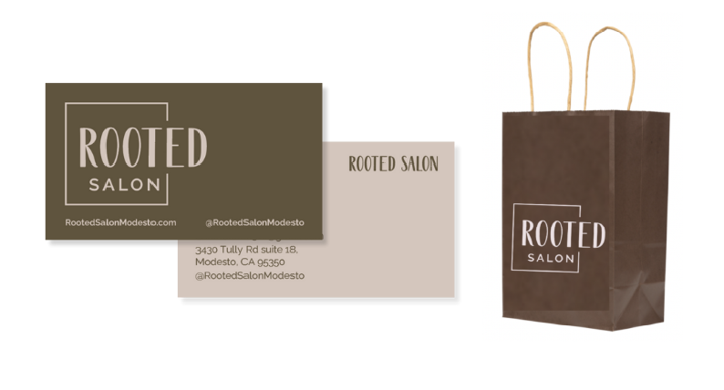
The exterior signage became both a statement and an invitation, blending sleek aesthetics with warmth to welcome clients before they even stepped inside. Every touchpoint—business cards, gift cards, and shopping bags—was crafted not just as branded items but as tangible representations of the salon’s new identity. Through a cohesive blend of branding, web design, and marketing strategy, we helped ROOTED Salon launch with impact.
The Impact
Excitement spread from the inside out. Employees embraced the change, feeling a renewed sense of pride in their space. Clients weren’t just noticing—they were experiencing. The careful design details and cohesive storytelling deepened connections, turning ROOTED Salon into not just a beauty destination, but a brand with a presence. Thanks to Gerbo Designs, a leading branding agency in Modesto, ROOTED Salon now stands strong in both its community and its market.
Case Study
How do you bring a legacy brand into the digital age through web design?
The Moment
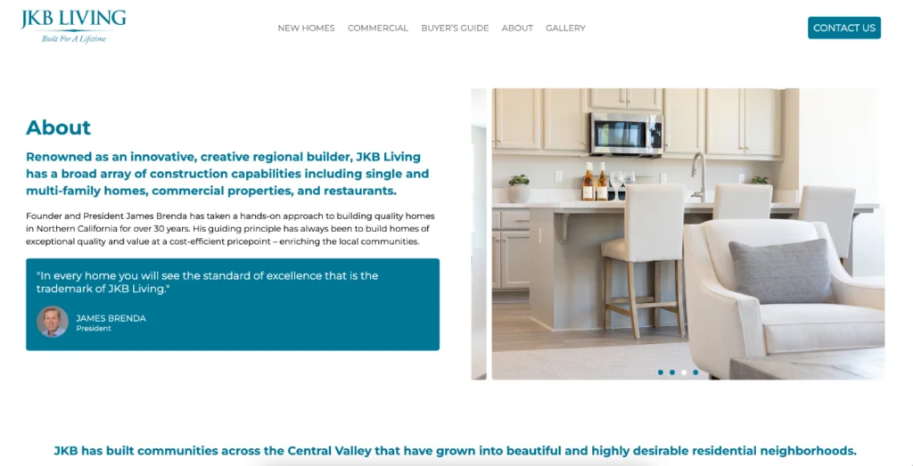
JKB Living had built a strong reputation in real estate development, known for their commitment to community-driven projects and quality craftsmanship. But their online presence told a different story—one that lacked the clarity, engagement, and modern functionality needed to reflect the company’s vision. Their existing website was outdated, difficult to navigate, and visually disconnected from the excellence they delivered in their projects. As a branding agency in Modesto, we were tasked with creating a website redesign that would not only showcase their portfolio but also invite exploration, instill confidence, and reinforce their industry leadership.
The Work
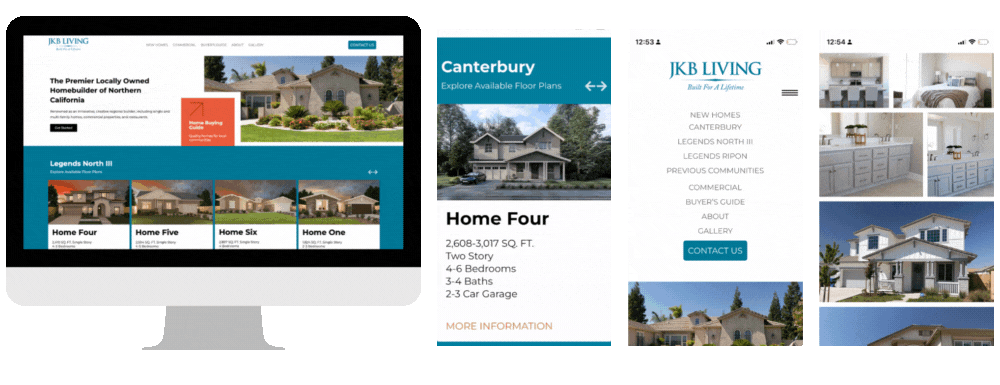
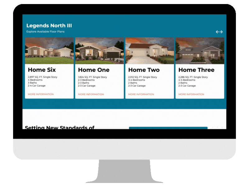
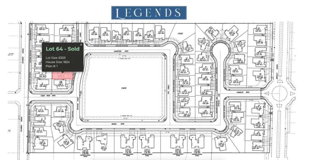
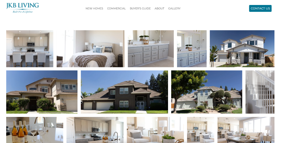
Our approach was more than just a redesign—it was a strategic reimagining of how JKB Living could engage with their audience online. We started with a clean, contemporary web design that balanced sophistication with accessibility, ensuring that every interaction felt seamless. High-quality photography became a central storytelling element, capturing the craftsmanship behind each project. Custom functionality brought the brand to life, including an interactive project map, dynamic sliders, and intuitive navigation to enhance user experience.
Through a refined digital marketing strategy, we ensured that the new website not only looked stunning but also performed—helping JKB Living reach and connect with the right audience.
The Impact
The transformation was immediate. The modern, engaging interface made it easier for potential clients and partners to connect, while the interactive elements encouraged deeper exploration of their projects. More than just a website, it became a powerful business tool, reinforcing JKB Living’s reputation for excellence and positioning them for continued digital growth, with the support of Gerbo Designs, the premier branding agency in Modesto.
Interactive Maps
The map feature allows users to view property information by hovering over a lot.
Gallery Portfolio
The gallergy page is a visually striking page that showcases the interiors and exteriors of the models.
User Experience
The website is thoughtfully organized for a seamless and intuitive browsing experience.
Visually Stunning
The website captivates with a sleek, modern design and engaging visuals.
Case Study
How does a brand evolve while staying true to its roots?
The Moment
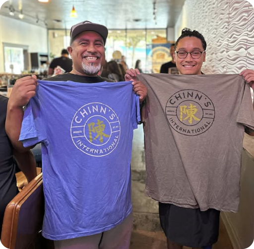
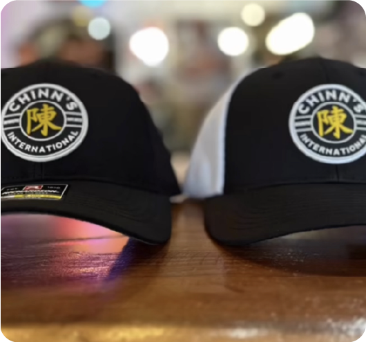
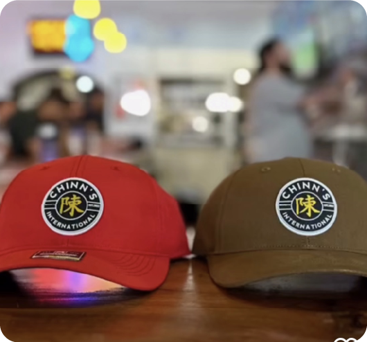
Chinn’s International had a vision: a bold, cultural brand rooted in craft, community, and collaboration. But while the foundation was there, the direction needed fine-tuning. With growing partnerships—including high-profile collaborations with top craft breweries—the brand needed more than just an identity. It needed brand consistency, clarity, and a scalable design system that could evolve with its growing influence. As a branding agency in Modesto, we were ready to help them amplify their cultural narrative.
The Work
We started by refining Chinn’s brand identity with a cohesive logo suite that reinforced recognition across different applications, from apparel to packaging. We designed custom merchandise, including apparel and hats, ensuring that each product was an extension of the brand’s cultural influence.
For milestone events and collaborations, we developed unique marketing designs that maintained authenticity while elevating the brand’s presence. Every visual decision—from typography to color palettes—was made with strategic branding in mind, ensuring a signature aesthetic that resonated with Chinn’s dedicated audience.
The Impact
With a refined brand system in place, Chinn’s International stepped forward with confidence. The updated branding and merch design strengthened connections with its community, allowing the brand to expand without losing its essence. Through thoughtful design and strategic brand alignment, Chinn’s evolved while staying rooted in what makes it unique, thanks to the expertise of Gerbo Designs, a trusted branding agency in Modesto.
Case Study
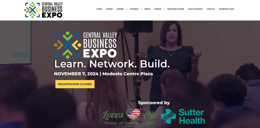
How do you turn an expo into an experience?
The Moment
The Central Valley Business Expo (CVBE) was more than just an event—it was a catalyst for business growth and community connections. But its brand and digital presence weren’t keeping up. With an outdated website, inconsistent marketing, and limited engagement, CVBE struggled to capture the energy and scale of what it truly offered. As a branding agency in Modesto, we were tasked with creating a dynamic brand experience that would drive attendance, engage businesses, and establish CVBE as a premier regional event.
The Work
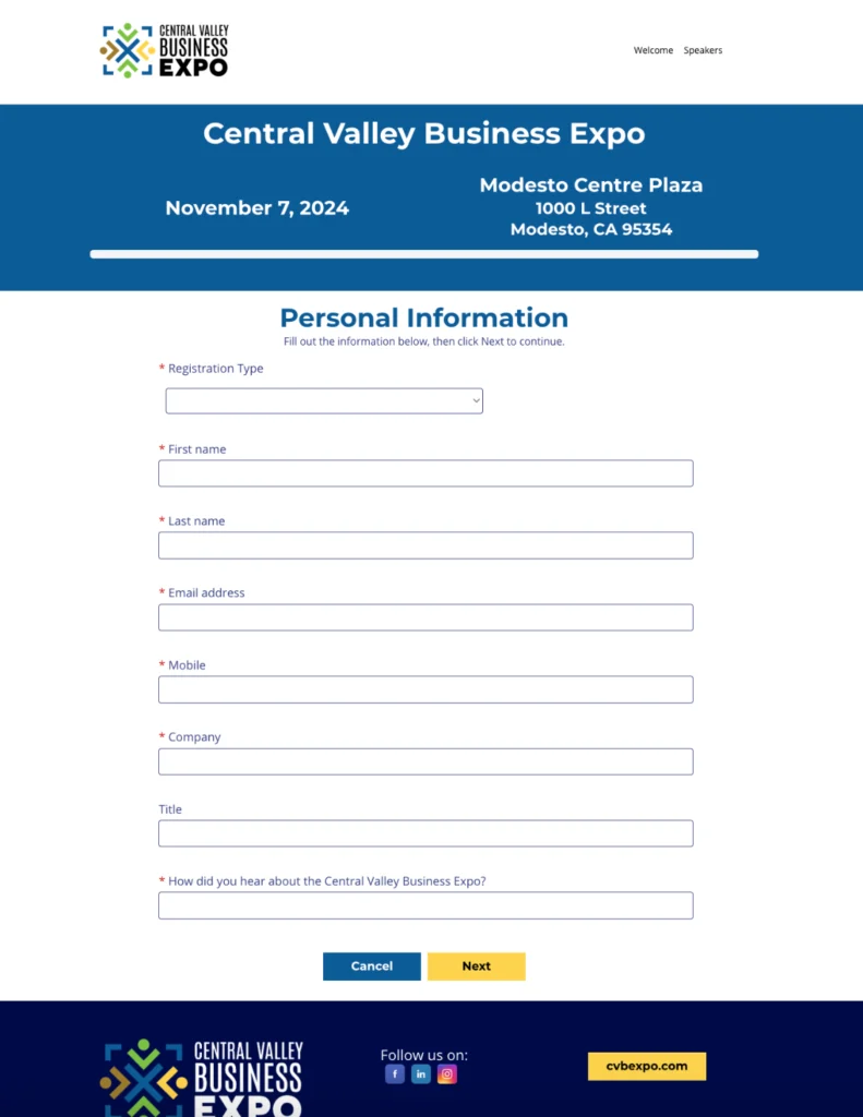
We approached CVBE as an ongoing movement for local businesses, not just a one-day event. The branding strategy was refined to be bold and instantly recognizable. The new website design became the hub of the experience—intuitive, engaging, and built for conversions.
A comprehensive marketing strategy was deployed across digital and traditional channels, including targeted Meta ads, email campaigns, and social media content. Large-scale visibility was achieved through billboards, radio spots, print publications, direct mailers, and high-impact flyers, ensuring the event reached every corner of the Central Valley.
The Impact
Attendance surged, engagement increased, and the business community took notice. The new brand identity and marketing strategy turned interest into action—more exhibitors, more attendees, and more meaningful connections. Beyond a single event, the expo now had a sustainable brand presence, reinforcing its role as a powerhouse for business innovation in the region, thanks to Gerbo Designs, your branding agency in Modesto.
Your Brand Could Be Our Next Case Study!
At Gerbo, a leading branding agency in Modesto, we specialize in creating impactful brand identities that stand out. Our team is ready to help!
We use cookies and similar technologies to understand how our website is used, improve performance, and support marketing efforts. You can accept, decline non-essential cookies, or review our privacy policy to learn more.